Loading…
IP Year 1
Statistical diagrams
Practise statistical diagrams with step-by-step help. Free account.
1. Collecting data, pictograms and bar graphs
Bus
- Tally
- Frequency
MRT
- Tally
- Frequency
Car
- Tally
- Frequency
Walk
- Tally
- Frequency
Total
- Frequency
| Mode of transport | Tally | Frequency |
|---|---|---|
| Bus | ||
| MRT | ||
| Car | ||
| Walk | ||
| Total |
📖 Worked example
The bar graph shows the favourite hawker food of a class. Find how many more pupils there are for Satay than for Nasi lemak.
Step 1 of 2
Work out what one small division stands for, then read the two bars
One small division stands for .
Satay: ; Nasi lemak:
Your turn
Try one like these, checked as you answer, with hints if you need them. Free, no sign-up.
2. Pie charts and bar graphs
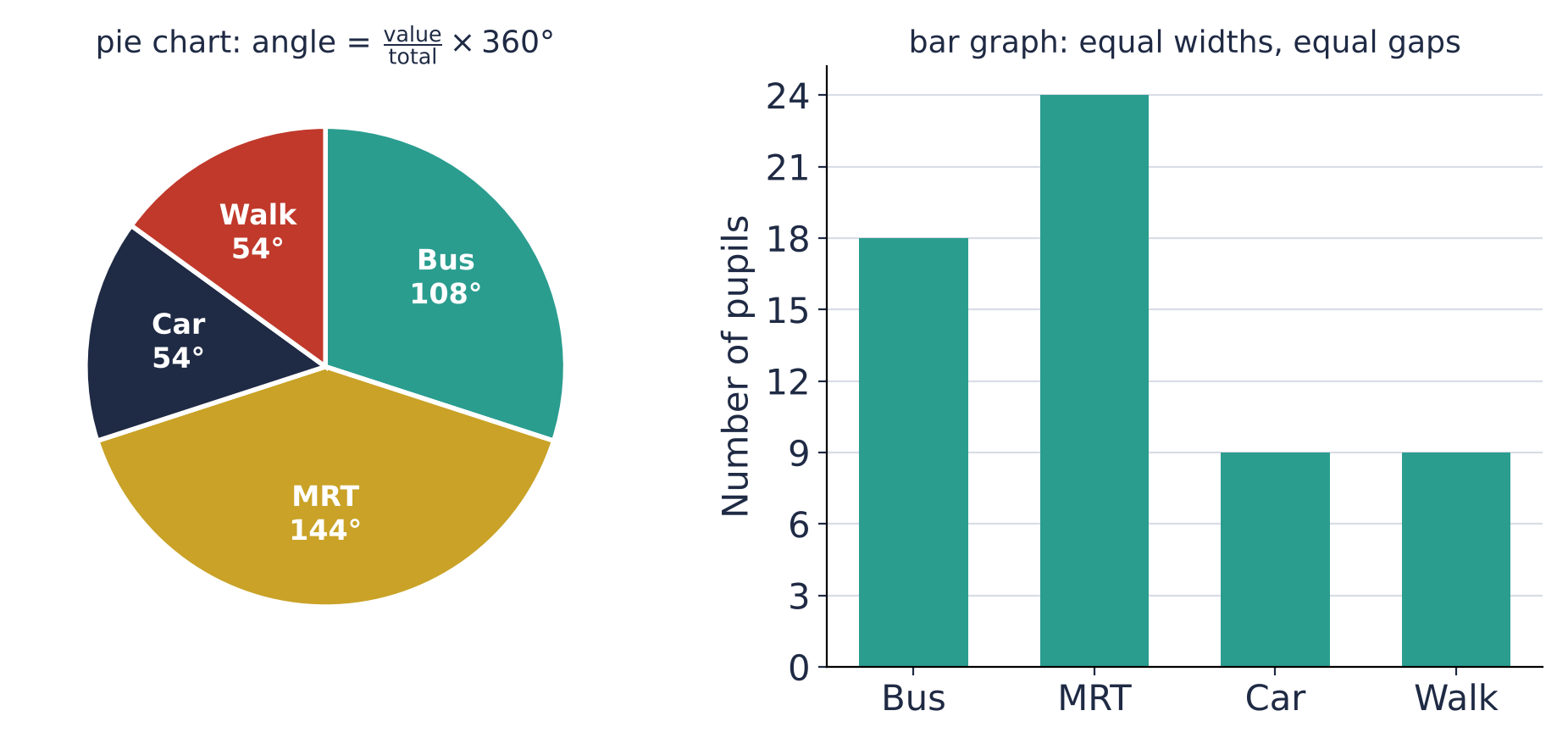
Angle for Bus: 18 out of 60
e.g.
From an angle back to a number: Car is 54°
e.g.
📖 Worked example
The table shows the CCAs chosen by Secondary 1 pupils. The information is to be shown in a pie chart. Calculate the angle of the sector for Uniformed.
| Item | Uniformed | Sports | Arts | Clubs |
|---|---|---|---|---|
| Number of pupils | 42 | 27 | 32 | 19 |
Step 1 of 2
Find the total
📖 Worked example
The line graph shows the monthly sales of a bubble tea shop. Find the sales in Apr.
Step 1 of 1
Work out what one small division stands for. Go up from Apr to the line, then across to the axis
At Apr, the sales was thousand cups.
Your turn
Try one like these, checked as you answer, with hints if you need them. Free, no sign-up.
3. Misleading graphs
vertical axis not starting at
- Why it misleads
- small differences look large
picture made wider and taller
- Why it misleads
- doubling both makes the area times
uneven gaps on a time axis
- Why it misleads
- the rate of change is distorted: equal distances on the axis are not equal times
bars of different widths
- Why it misleads
- the wider bar looks bigger
no key or scale
- Why it misleads
- values cannot be read
| Look for | Why it misleads |
|---|---|
| vertical axis not starting at | small differences look large |
| picture made wider and taller | doubling both makes the area times |
| uneven gaps on a time axis | the rate of change is distorted: equal distances on the axis are not equal times |
| bars of different widths | the wider bar looks bigger |
| no key or scale | values cannot be read |
📖 Worked example
The number of cars sold went up from in 2019 to in 2023, which is times as many. The artist drew the 2023 picture times as tall and times as wide as the 2019 picture. The area of the 2023 picture is times the area of the 2019 picture. Find the value of .
Step 1 of 1
Area grows with BOTH the height and the width
The picture looks times as big, though the number is only times as large.
Your turn
Try one like these, checked as you answer, with hints if you need them. Free, no sign-up.
4. Choosing a statistical diagram
Pictogram
- Best for
- small counts, shown with pictures and a key
- Limitation
- part of a symbol is hard to read exactly
Bar graph
- Best for
- comparing separate categories
- Limitation
- does not show each part's share of the whole
Line graph
- Best for
- change over time (the trend)
- Limitation
- values between the plotted points are only estimates
Pie chart
- Best for
- each part as a share of the whole
- Limitation
- no actual numbers unless the total is given
| Diagram | Best for | Limitation |
|---|---|---|
| Pictogram | small counts, shown with pictures and a key | part of a symbol is hard to read exactly |
| Bar graph | comparing separate categories | does not show each part's share of the whole |
| Line graph | change over time (the trend) | values between the plotted points are only estimates |
| Pie chart | each part as a share of the whole | no actual numbers unless the total is given |
📖 Worked example
The pie chart shows the fruit sold at a stall. Which statement does the pie chart support?
Step 1 of 2
Check each statement against the diagram: true, false or can't tell
The Oranges and Apples sectors together are more than half of the pie. against . True.
There are 28 fruits for Apples. The total is not given: a pie chart alone gives fractions of the whole but not numbers. Can't tell.
There are 84 fruits for Apples. The total is not given: a pie chart alone gives fractions of the whole but not numbers. Can't tell.
The Durians and Mangoes sectors together are more than half of the pie. against . False.
Your turn
Try one like these, checked as you answer, with hints if you need them. Free, no sign-up.
Free account
What you get when you sign in
Everything on this page stays free. An account is where statistical diagrams practice starts adding up.
- Endless questions on every chapter, at every level
- Your mistakes tracked by type, so you see what keeps costing marks
- Revision reminders before a topic fades
Start freeFree account. No card. Takes a minute.
Compare browsing and a free account
| Browsing | Account | |
|---|---|---|
| Read the notes and print worksheets and papers | ✓ | ✓ |
| Try a question with marking, hints and the step guide | ✓ | ✓ |
| Endless questions on every chapter, at every level | – | ✓ |
| Levels that unlock as you improve | – | ✓ |
| Your mistakes tracked by type, so you see what keeps costing marks | – | ✓ |
| WA practice papers on the chapters being tested | – | ✓ |
| Revision reminders before a topic fades | – | ✓ |
| Progress page and leaderboards | – | ✓ |